
iOS 26 updates the Share Sheet

Apple just gave the Share Sheet in iOS 26 a much-needed cleanup, and your thumbs will be thankful.
Apple has refined the iPhone share sheet in iOS 26, showing fewer actions up front to make the interface feel lighter and easier to use. Instead of hitting you with every possible option right away, it now presents a short, focused list tailored to what you’re most likely to use.
You can still swipe up or tap “More” to reveal everything else. Nothing has been removed. But the default view feels calmer, less like a filing cabinet dumped onto your screen.
That matters, especially if you’ve built up a long list of apps that all want a piece of the share sheet. Over the years, the share sheet had turned into something of a mess.
Every app could add its own actions. Every shortcut you created that accepted shared input would pile on too. What used to be a simple menu ballooned into something that required scrolling, searching, and sometimes giving up entirely.
A familiar layout, with less clutter
The layout is still familiar. Suggested contacts appear at the top, followed by a horizontal strip of apps like AirDrop, Messages, and Notes. Under that, you’ll see a smaller set of available actions. The rest are hidden until you swipe up or tap the new “More” button.
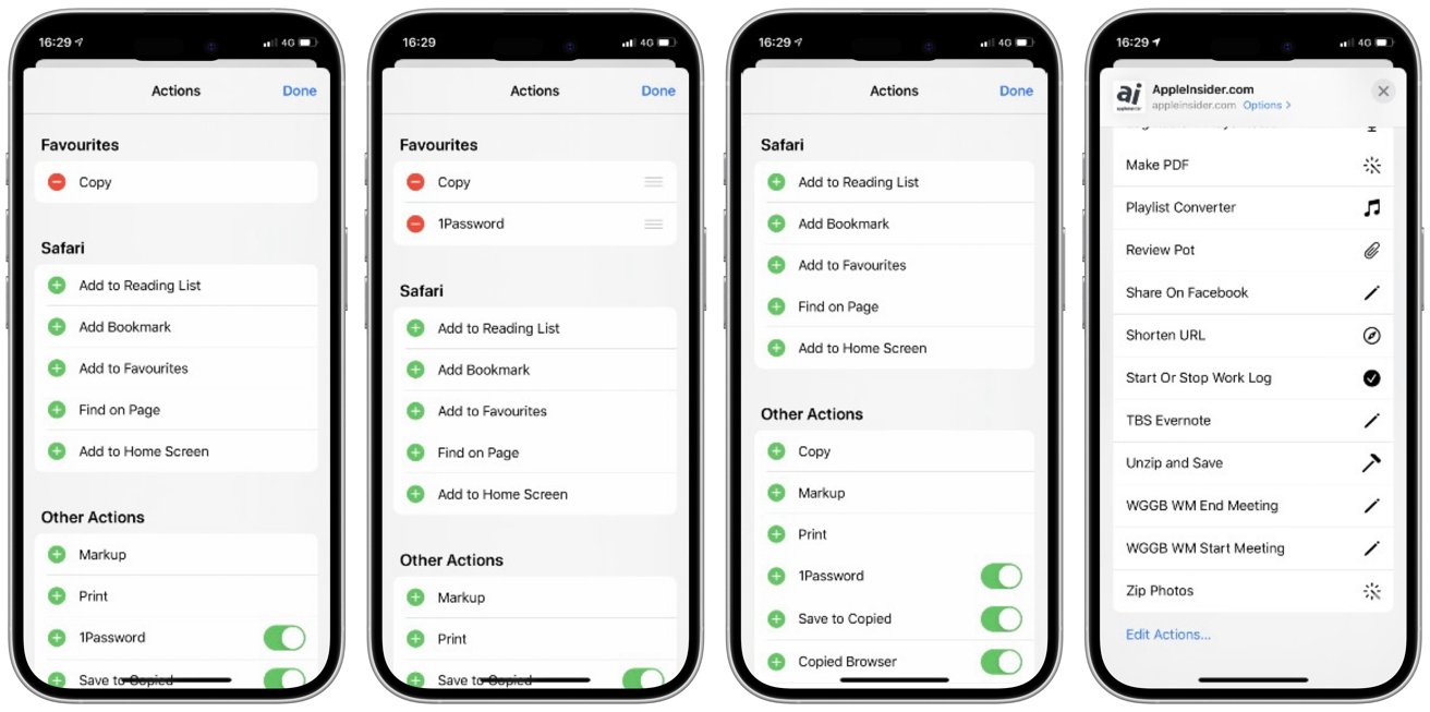
The old Share Sheet style
Shortcuts were a big part of the problem. If you had more than a few, they could overwhelm the list. Every shortcut that accepted input from the share sheet showed up by default, even if you only used it once.
That behavior hasn’t changed, but at least they’re out of sight unless you go looking for them. The change is especially helpful for power users.
People who build out complex shortcuts, or install dozens from Reddit and RoutineHub, no longer have to scroll past an entire automation library just to find the Print button. It’s a small quality-of-life fix that makes the system feel less chaotic.
Customization still works like before
If you’ve customized your share sheet, you don’t have to start over. The “Edit Actions” button is still at the bottom of the sheet, letting you pin your favorites, hide the ones you don’t use, and drag items into the order that works best for you.
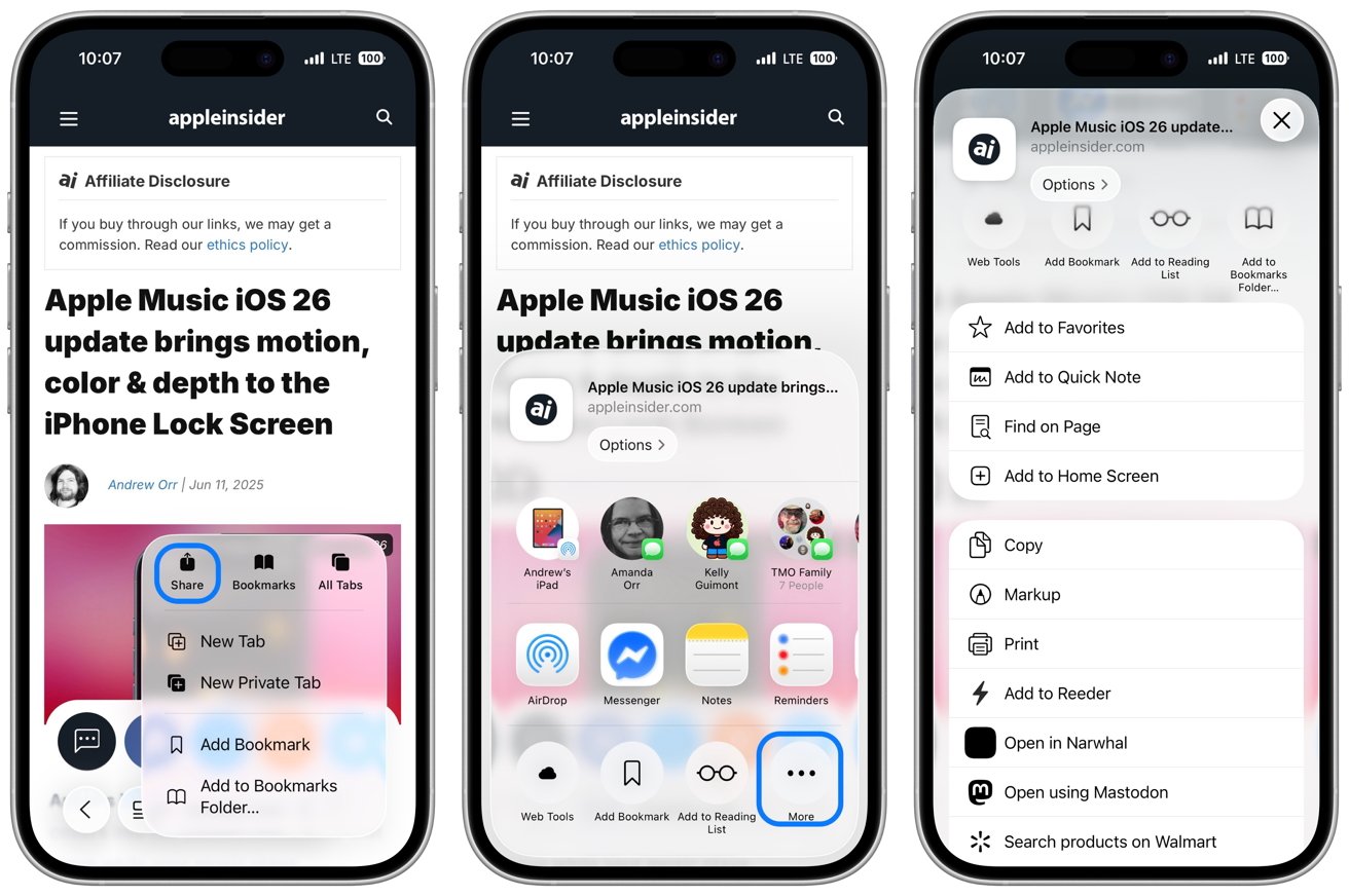
The new Share Sheet style in iOS 26
Suggested contacts still show up at the top of the share sheet, powered by Apple Intelligence. Long-pressing a contact brings up the “Suggest Less” option, just like in previous versions of iOS. If the suggestions aren’t useful, you can quietly tell the system to back off.
And just to be clear, nothing about the fundamental interaction has changed. The share sheet still slides up from the bottom of the screen. You still dismiss it by swiping down or tapping outside.
It’s the same tool, but less bloated, more thoughtful, and easier to use. It’s not flashy, but for frequent share sheet users, it’s a noticeable and appreciated change.